Presentations
What makes a good presentation?
- Content: plan a logical structure that shows your knowledge/research.
- Delivery: communicate your ideas confidently and effectively.
- Engagement: make a connection with the audience.
- The information below offers guidance on the planning, designing and delivery phrases of creating presentations.
- There’s also a hand trifold guide to download and print about the stages below.
1. Planning
Beginning:
- Introduce yourself: who are you?
- Outline the topic: what is your talk about?
- The hook: interesting facts, statistics or quotation to grab the audience’s attention.
- Justify: why is this a topic of interest?
- Coming next: what key points will you discuss?
Middle:
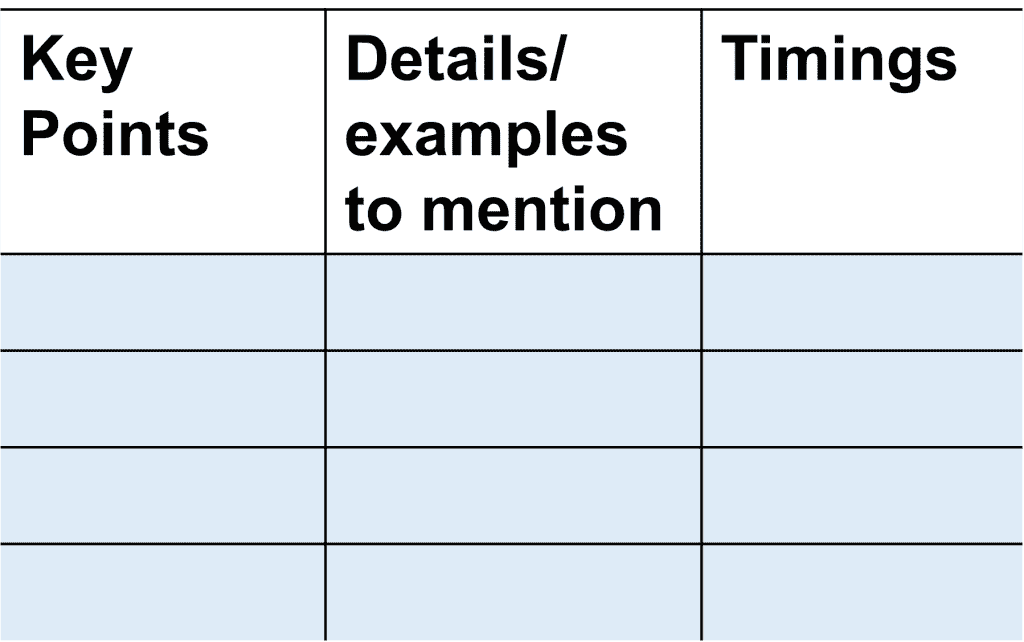
- Divide the topic into key points to discuss.
- Consider what details or examples you might mention.
- Plan how much time you’d like to spend on each point.
- Consider using a planning grid such as the one below.

End:
- Summarize: what main points were covered?
- Memorable ending: state your final point; have a call to action; end with a rhetorical question.
- You can also invite questions.
- Prepare by thinking about what your audience may ask.
- If you don’t know the answer, say ‘Can I come back to you?’ or open it up to the audience ‘What does everyone else think?’
2. Designing Visuals
- The visual appearance of your presentation is important.
- We learn 90% of information visually and only 7-11% through hearing (Bradbury, 1995, p. 64).
Text:
- Use clear headings to guide your reader.
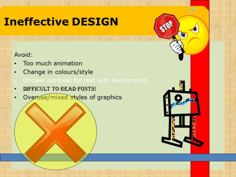
- Bullet point information & avoid too much text on each slide.
- Aim for around 25 words per slide (Van Emden and Becker, 2016, p. 40).
- Use sans serif fonts that are easy to read such as Arial, Calibri and Veranda.
- Aim for around 24 point font for PowerPoint slides.
- Pick a font colour that contrasts with the background.

Graphics:
- Use graphics that highlight the key messages of your content.
- Avoid mixing styles or using too many.
- Be careful to only pick copyright cleared images.
- Look at this guide to finding and using copyright cleared images
- Design your own images and infographics with Canva: https://www.canva.com/
Colour:
- Choose a consistent colour palette to use throughout.
- Use the colour wheel (beside) to aid this.
- Complimentary: •Opposites in colour wheel e.g. blue and orange.
- Monochromatic •1 colour in different shades and tints.
- Analogous •3 colors next to each other on the color wheel.

3. Delivering
- Avoid speaking too quietly or quickly. Remember to pause between points.
- To improve delivery, aim to rehearse before the talk.
- Create prompts such as a script, PowerPoint notes or A5 index cards.
- Try the Orai app to test your delivery, or ask your friends to watch.
- What worked well? What areas do you need to improve?
Non-verbal communication:
- Keep your body language open rather than closed.
- Closed body language can include folded arms, crossed legs and hands in pockets.
- Instead, aim to engage your audience with eye contact.
Can you spot the mistakes?
- Watch the video below.
- What mistakes are made in terms of design and delivery?
- Watch until the end of the video to get the answers!
Sources consulted
- Bradbury, A. (1995) Successful presentation skills. London: Kogan Page Limited.
- Levin, P. and Topping, G. (2006) Perfect presentations. Maidenhead: Open University Press.
- Plymouth University (2019) Presentations. Available at: Presentations.pdf (plymouth.ac.uk) (Accessed: 15 December 2021).
- Van Emden, J. and Becker, L. (2016) Presentation skills for students. 3rd Edition. Basingstoke: Palgrave Macmillan.

eBooks:
Read more about presentations here: https://tinyurl.com/ybhfp48d
